There’s something about Danish Illustrator Niclas Mortensen’s work that immediately captures your eye and won’t let go. His bold colors, immaculate detail and strange style of heavy metal meets photo realism is what makes him stand out—you might say it’s beautifully brutal. We aren’t alone. His style continues to garner attention from the world’s largest brands and bands. We spoke with the talented illustrator about his early beginnings, super pow pow, and how he made posters for the all-mighty Wu-Tang Clan.

Your brother was an influence in your artistic journey. Tell us how your art journey came to be.
When I was growing up, my big brother used to draw and paint a lot (he still does and is also a tattoo artist now), and I think that really inspired me to also start creating art. I used to help him pick colors since he’s colorblind, and I loved helping out in whatever small way I could. He did a lot of graffiti back then (early/mid 90’s) and I used to copy his drawings and make my own drawings of his very cool graffiti characters.
Since then I’ve been experimenting with all sorts of art and styles. From pencil drawings of my favorite heavy metal album covers as a teenager, to Warhammer painting, oil painting, graffiti and digital art.
I’ve been playing drums almost my entire life, so when I started a band around the age of 19, it was very convenient if I could do all the designs and logos myself!
Back then there was a site called Emptees (RIP), where illustrators and designers could showcase their t-shirt designs and comment on each other’s work. I so badly wanted to be a part of that group: posting cool drawings, showing them to like minded artists, and getting opinions from some of my favorite artists. I started posting on there, and slowly started getting jobs from bands and brands that liked my stuff. Since then, the clients have been growing bigger and bigger through the years, and I’m beyond excited about all the amazing bands and brands I’ve had the privilege to work with!
How would you describe your visual style, and how has it evolved since you first began working as a designer and artist?
I’ve been through almost all art styles: photo realism, dot work, cross hatching, black and white, cartoony, ultra super pow pow pow colorful stuff. Even tattooed a bit for a period!
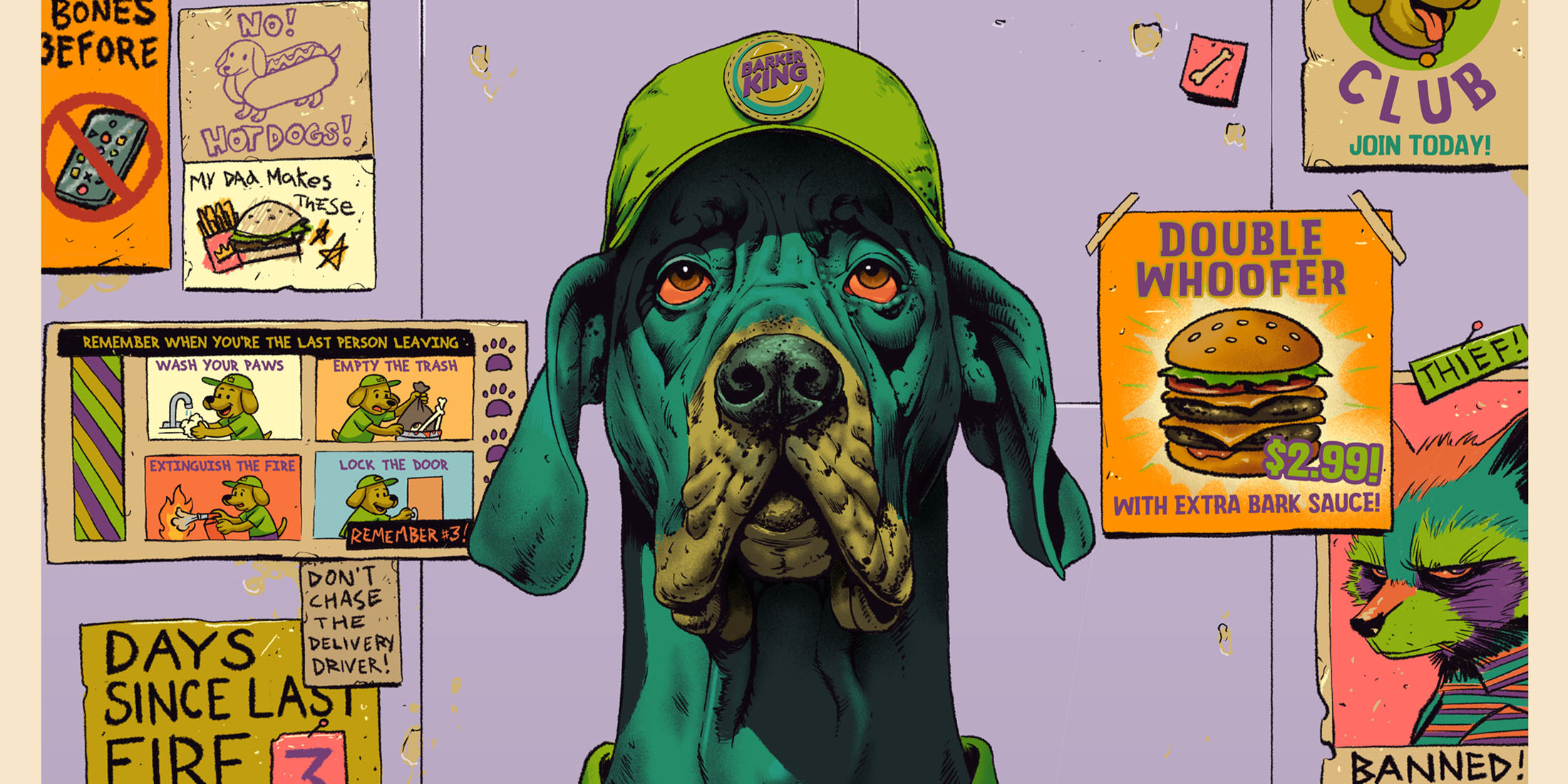
I started out in the more heavy end of art, wanting to create obscure, crazy, occult, dark and evil stuff for metal bands. I really liked the aesthetics of a brutal metal cover. I still enjoy the brutal, occult and obscure, and I still work with a lot of metal bands, but I try to incorporate as many bright and visually interesting colors and elements as I can!
At this point in my art journey, I’m focusing more on creating fun, colorful pieces of art that makes people think and smile. Stuff that is interesting to look at for more than 10 seconds while you think “that’s brutal, dude.”

You move between graphic design, fine art, and creative direction. How do you navigate the boundaries between these disciplines?
As I mentioned earlier, I’ve been around the block when it comes to styles. I have a media graphic design degree, and learned everything about HTML, letter spacing, rules for this and that. All that stuff. I’m not really big on rules and what you can and cannot do. I like doing things my own way, and if you ever look at my Photoshop files, you’ll see that I’m probably the only one who can find my way around in those.
I think my upper hand in having explored all these different styles is that I can accommodate almost every need a client could have.
I can do hyper realism drawings, extremely simple linework, logos, comic book stuff, brutal death metal art, and so on.
Every project is different, and every project needs a different approach, and I like that I’m able to do (almost) everything!

Speaking of bright and vibrant, your work features bold color choices and geometric forms. How do you use these elements to communicate meaning?

My older, more heavy stuff used a lot of circles. I was big on the circles! I like the bright contrast between a decaying witch goat man (for example), and the brightness of a big, round, white circle. There’s something in that space between the very, very white part of a drawing and the very dark contrast that really speaks to me. It almost becomes epic and otherworldly in a way.
My newer, more colorful stuff mostly started out as a way to create something new and different that I hadn’t worked with a lot before. It turned out to be a lot of fun, and people really seemed to enjoy that new, colorful style, so I have been trying to evolve it and perfect it even more since. I like to use colors and have people think “how the f*** did he come up with that?”
Working with bands and brands, what’s the hardest part balancing between commercial and personal art?
That’s a good question, actually. I wish people would pay me to just sit around and create my own stuff.
I mean, I LOVE creating stuff for bands and brands, but most of the time you have to follow somebody else’s idea, and bring that to life. You get a brief, and you have to work from that brief. It’s fun, but can definitely be challenging at times. “We want a dragon that sets fire to a village, and in the background, there’s a castle being hit by lightning, and that lightning forms the shape of another lightning-dragon, holding a decapitated knight in its claws.” I mean. Okay. Sounds cool, but how am I going to do this epic brief justice?
My mind is more like “let’s draw a man with 6 arms and a big, weird hat. Let’s make him neon pink. And he’s holding a fish, too.” I think a lot of artists wish they had more time to create what’s actually in their own minds, instead of what’s in other people’s minds.

What are some of your favorite projects or art pieces you’ve worked on over the years?
I’ve been doing stuff for everything from pop singers and beer labels to death metal bands and board games. It’s so hard for me to choose any project over another, because all projects have taught me something, in one way or another.
If I had to highlight something, it has definitely been the merch I’ve done for Danish metal festival ‘Copenhell,’ my work with Netflix for a Stranger Things exhibition, the hand bag I designed for Oli Sykes clothing company Drop Dead, the two posters I did for the mighty Wu-Tang Clan, and all the crazy stuff I’m working on at the moment, in my more colorful style: comic books, trading cards, and a lot of other fun stuff!

What keeps you inspired to create, and how do you define success in your practice today?
One thing that really keeps me inspired is people who keep hiring me to work with them. It’s so validating and such a big pat on the shoulder that people actually enjoy the stuff you create enough to want it on their official merch, album art, comic book, trading card, or whatever project they’re working on.
I’m just a dude from Copenhagen who likes to play the drums and draw Ninja Turtles. So getting the recognition for my art is definitely a part of what keeps me going. I mean, I would still create and draw everyday if I didn’t work with clients, but it definitely pushes you, when you know that this stuff gets out to the public as well!
Anything coming up that you’re excited about?
I have A LOT of fun projects in the works! Working with a very cool comic book publisher on some very cool covers featuring my four favorite reptiles; a series of collector cards with some very disgusting kids; and a few magical cards for a very well known card game!
Any last words?
Thanks for featuring me on this! Very stoked about having people see the stuff I do and being a part of my little art journey!

Leave a Reply
You must be logged in to post a comment.