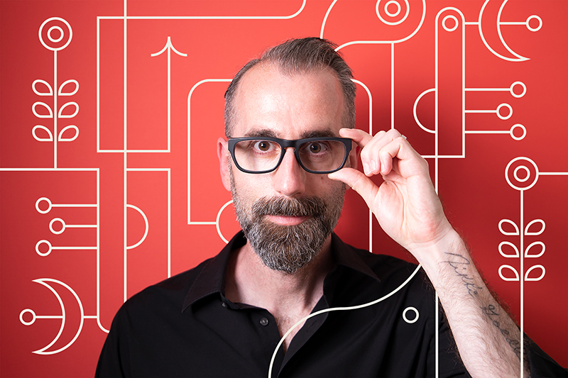
Adam G is a self described “messy, prolific and wishy-washy designer” who also happens to be a neat freak that craves order. Welcome to the dichotomy of TRÜF, which is the creative design studio where Adam balances his creative chaos and order, which results in impeccable designs. There is a blurred line between structured illustration and free flowing fine art that makes for eye-catching and distinctive imagery that defines the TRÜF brand. Adam calls it “Messymod”, short for Messy Modernism. We just call it awesome.

Instagram: @trufcreative
Website: trufcreative.com
Hometown/Current location?
Santa Monica, CA
Morning person or night owl?
1000% night owl. I’m ugly in the morning.
Last show you binged?
Andor. I geek-out on Star Wars.

If you had a theme song, what would it be?
“Everything in its right place” – Radiohead
Best advice you’ve received?
“When you make something no one hates, no one loves it.” – Tibor Kalman
This wasn’t advice given to me personally but they’re great words to design and live by.
One thing you can’t live without?
Oxygen. Espresso is a close second.

How do you want to be remembered?
That I left the place in better shape than I found it (or at least made it a little more interesting).
How would you describe your particular style of art?
I call it Messy Modernism or “Messymod” for short. It’s messy because I explore and “weird out” with abandon but I always try to adhere to clean, minimal, modernist principles. It’s kind of a mix between my professional design skills and experiences and the free-flowing nature of my fine art style. It’s totally anal and loose at the same time. Did I just use “anal” and “loose” in a sentence? Yes, yes I did.

As a graphic design firm, how is it being a free artist then going back and working within the confines of a client’s project scope?
I actually love it. Oddly, they kind of inspire and feed off of each other. I really enjoy working within strict boundaries when it comes to corporate/client work. It keeps me grounded but it also helps me explore what can be done within those restrictions. Regardless of the confines, I still explore recklessly making sure that the final concepts work with the client brief. Often those reckless explorations inspire a lot of my artwork and illustrations. There’s always some interesting cast-offs and nuggets on the side of my Illustrator art boards that can be used for other things. I think that’s why people can see a lot of strict design language in my artwork whether it’s typographical, Bauhaus-ish or a mix of all of it. On the flip side, sometimes brand ID ideas will come out of my artwork as well. At this point, the lines between my art and design are becoming blurred and I dig it. I’ve reached some kind of balance and equilibrium between these two worlds that works for me and scratches all my itches. I’m always trying to find the balance and harmony between contrasting elements. That in-between.

Can you tell us a little bit about your background and how you became an artist?
I know it’s cliché to say, but I came out of the chute that way. From a toddler I was drawing and painting and I was fortunate enough to have parents that nurtured that. I attended arts and sciences schools all the way through high school and planned on becoming a painter after I graduated from college. I moved to NYC, partied through all my savings and had to quickly get a job to survive. So, I accidentally ended up as a junior graphic designer at an ad agency since they were offering me a paycheck. Ten years later, I worked my way up the ladder to Creative Director and then got sick of using my creativity to sell shit I didn’t care about. I suppose I traded my passion for mere survival and didn’t realize how badly it would affect me down the road. The only thing I had passion for were the design aspects of the ad business so I decided to move back to LA, start TRÜF and do things my way. That being said, it still wasn’t satisfying my creative itch so I slowly started to get back into art for art’s sake. And then a funny thing happened which was that my art style and design styles started to seamlessly merge and I realized I could incorporate a lot of it into TRÜF. We could be both corporate and artful and weird all at once. Many people said we shouldn’t do it and it would alienate a lot of the client base but I didn’t care. Fuck it. Not everything can be Swiss! Clients now seek us out for that added dose of artfulness – for something a little different. And here I am – in Rooster mag!


What are some of your favorite art tools to work with?
This is a boring answer but it’s really a small moleskine notebook and Adobe Illustrator. I’m at the point in my experience where I can do shitty little thumbnails in a notebook, or not at all, and then jump straight to Illustrator. Lately I’ve been getting more into the iPad and stylus but am not quite comfortable enough yet to make it an essential tool. Ironically, something about the confines, physical distance and clumsiness of the desktop and mouse keeps my work more precise and squeaky clean. I tend to love a squeaky clean mess, as you can probably gather.
What is your design process like?
My design process for brand design is fairly standard stuff. Discovery > Brief > Creative Exploratory > Concepts > yada yada yada…
My process for the illustration/art completely lacks process and is more of a total freeform exploration where I like to see what emerges. Sometimes it’s an animal or a landscape, a face or a typographic piece, but whatever emerges just comes from me noodling, manipulating, finding complementary shapes and finding relationships and connections within the designs. It’s really organic and loose. Since my style is so conceptually loose and inconsistent, I really try hard to create my own restrictions through my own design language by using repetition of shapes, lines and color palette to create a consistency and through-line across all my artwork.

You work pretty exclusively with black, white and red; what about that palette led you to that creative decision?
Red, black and cream (or white) are just primal colors to me – reminiscent of charcoal, blood and stone. I think if you see most hieroglyphics or cave paintings, they’re nearly all done in that palette. So I guess I’m just a caveman? Like I said above, it also helps to create a consistency in my work and binds it all together. I’m not opposed to color at all, but for me, I really try to be minimal with my palette and not use every crayon in the box. It’s kind of become a calling card at this point. I’ve always been taught to value concept over execution and using a minimal color palette really helps elevate the form and balance of the piece over the technique. And that’s what I’m always trying to achieve. Sometimes I nail it, other times…not so much!
What have some of your biggest influences been?
My biggest influences have been a few of my Creative Director bosses when I was coming up in the ad biz. They saw something in me that I didn’t, and really helped nurture, harness and control my creativity to be more professional and composed – to serve a purpose beyond myself. But if we’re talking about general creative influences, I really draw from a lot of different places from design “gods” to chefs and musicians. On the design and art fronts: Calder, Miró, Escher, Chuck Close, Paul Rand, Lubalin,the Vignellis, Reid Miles. In music, John Coltrane. I feel jazz really embodies my process where the artist has to be masterful at their craft in order to explore and bend the boundaries. For architecture, Frank Gehry. For food, Wylie Dufresne (molecular gastronomy). I guess I just really appreciate and am inspired by artists that can elevate their craft and make people think differently about it regardless of their medium. That creative rule-bending spirit all comes from the same place – whatever that place is!

How do you like to spend your time when you aren’t working?
When I’m not designing and illustrating I’m designing and illustrating. I love it. But when I do get away from myself, I like to spend time traveling and experiencing other people, places, cultures, music and food. There’s nothing better than seeing the world if you have the luxury to do so. Technology has really opened up the world to everyone, but at the same time it’s made everyone complacent and closed-off in people feeling they can experience the world through a screen. And that’s bullshit. Nothing takes the place of actually being there with all your senses. Nothing.
Who are some of your favorite artists to follow right now?
I actually don’t follow any artists in a groupie sense. Of course I follow great artists on IG. It’s not that I feel like there’s not amazing art happening but I also feel like it’s so wrapped up in “likes” and influencer-garbage-algorithmic-hype that I try not to get too wrapped up in it – even though I do. I often catch myself being disappointed that a piece of mine that I really loved didn’t rake in the likes – and that’s just so wrong. I have a hunch that some of the most amazing artists, musicians, whoever, aren’t even on social media. They’re busy creating great stuff “IRL” rather than feeding the machine.

What do you enjoy most about design?
Cleanliness and options! I’m kind of a messy, prolific and wishy-washy designer but at the same time I’m also a neat freak that craves order. Design, specifically digital design, enables me to have the best of both worlds without literally getting my hands dirty or constantly wasting raw materials. Beyond that, design really enables us as a design studio to leave our visual DNA in the cultural zeitgeist, but more importantly, it helps us empower and inspire the companies we work with to be more artful and thought-provoking no matter who they are.
Shameless plugs?
Version 2 of our Messymod playing cards in collaboration with Art of Play is coming out soon. And it’s a freaky, fun, premium deck that we’re super proud of.
I have an online course on Domestika called “Artistic Resources for Powerful Branding Design” that covers a lot of stuff that I talked about above. Check it out.
We’re doing a wooden sculpture collaboration with Umasqu where they’ve brought one of my pieces to life and will be available for purchase soon.
TRÜF just did the brand design for the LA Times 101 Best Restaurants of 2022 and they did a great job embracing the strange.
We’ve also released a ton of new, bizarro art prints for sale on messymod, our print shop.


 All photos are courtesy of ©TRÜF
Leave a Reply
You must be logged in to post a comment.